Live Demo
SDK in Action
See how the PrimeStyle Try-On React SDK works on a real product page. The button below is a live <PrimeStyleTryon /> component powered by our API.
yourstore.com/products/bloom_80
Your Brand
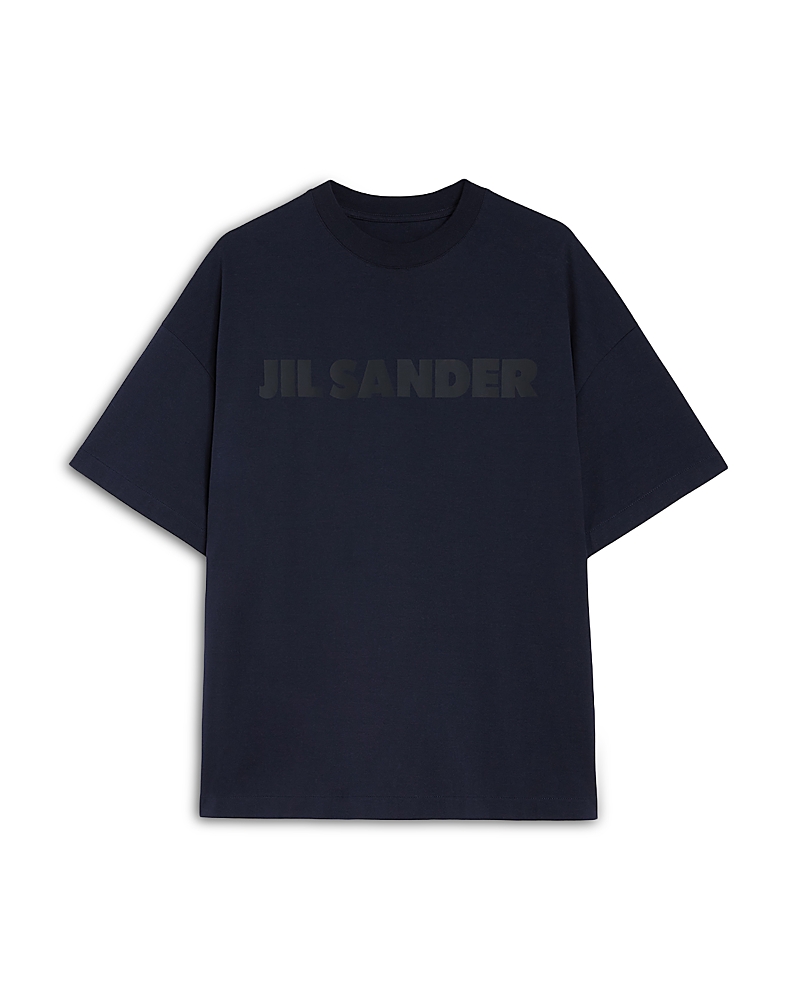
Jil Sander Logo T-Shirt
$489.00
SDK React Component
Free shipping on orders over $50
Integration Code
3 steps: install, set env, use component
import { PrimeStyleTryon } from '@primestyleai/tryon/react';

function ProductPage({ product }) {
  return (
    <div>
      <h1>{product.name}</h1>

      <PrimeStyleTryon
        productImage="https://images.bloomingdalesassets.com/is/image/BLM/products/0/optimized/15494310_fpx.tif?wid=800&qlt=100,0&layer=comp&op_sharpen=0&resMode=bilin&op_usm=0.7,1.0,0.5,0&fmt=jpeg&4msn=.jpg"
        buttonText="Try It On"
        buttonStyles={{
          width: '100%',
          padding: '14px 24px',
          borderRadius: '10px',
        }}
        modalStyles={{
          backgroundColor: '#1a1a1a',
          textColor: '#ffffff',
        }}
        onComplete={(result) => {
          console.log('Result:', result.imageUrl);
        }}
      />
    </div>
  );
}
Customization
Pass buttonStyles and modalStyles props to customize appearance.
Listen to onComplete, onError, onProcessing callbacks.